The walls in my corner office were bright red. Not a warm terracotta or soft coral. Aggressive, attention-demanding red. My agency partner had chosen the color during our office redesign, calling it “energizing” and “bold.” Every morning, I walked in and felt my nervous system spike before I even opened my laptop.
After six months of that red room, I repainted it myself one weekend. Soft gray-blue, the color of early morning fog. My partner teased me about creating a “nap room,” but my productivity doubled that month. The difference wasn’t just aesthetic. Color affects how introverts process their environment, and getting it wrong creates constant low-level stress you might not even recognize.
Research from environmental psychology studies at the University of British Columbia shows that color saturation and brightness levels significantly impact cognitive performance and emotional regulation, particularly for individuals with higher sensory processing sensitivity.
Your color environment shapes your daily energy budget. For someone who processes stimuli deeply and recharges through solitude, the wrong palette creates unnecessary depletion. The right one supports your natural rhythms.
Why Does Color Matter More for Introverts?
Color operates as continuous environmental input. Unlike conversations you can step away from or notifications you can silence, your visual environment persists. Each wall, piece of furniture, and decorative choice either supports or undermines your baseline state.
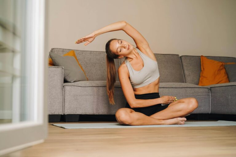
What’s your personality type?
Take our free 40-question assessment and get a detailed personality profile with dimension breakdowns, context analysis, and personalised insights.
Discover Your Type8-12 minutes · 40 questions · Free
During my years managing creative teams, I noticed something consistent. The open office spaces with bright accent walls and “energizing” color schemes? My most talented introverted designers requested headphones and developed what looked like avoidance patterns. When we moved to a new building with softer, more neutral tones, those same designers stopped taking as many “fresh air breaks” and stayed more present throughout the day.
The difference came down to cognitive load theory. High-contrast, saturated colors demand more processing power. Your brain must constantly interpret and respond to visual stimulation that serves no functional purpose except “visual interest.” For people who process information deeply, this background noise accumulates.
Think about your most productive spaces. Chances are they feature colors that recede into the background instead of demanding attention. This isn’t about preferring boring environments. It’s about creating space for the mental processes that matter to you.
Which Colors Form the Core Introvert Palette?
Certain color families consistently support introverted processing styles. Not because introverts share identical taste, but because these hues minimize stimulation while maintaining visual interest.
Soft Blues: The Default for a Reason
Blue dominates calming environments for measurable reasons. Data from perception studies at the American Psychological Association indicates blue wavelengths trigger lower physiological arousal compared to warmer hues.
My home office uses what paint companies call “Swedish blue.” It’s barely blue at all, more like white with blue undertones. In certain light, it reads as gray. That ambiguity works. The color never announces itself. It simply exists as a backdrop for whatever requires your attention.
Effective blue tones for introverted spaces: slate blue with gray undertones, powder blue with significant white content, blue-gray that shifts depending on natural light, and duck egg blue with subtle green notes. These variations share low saturation and medium-to-light value, creating presence without dominance.
Sage and Forest Greens: Grounding Without Weight
Green functions as the visual equivalent of middle ground. Neither warm nor cool, neither advancing nor receding too strongly. For spaces where you need to maintain steady focus over extended periods, green tones work.
I painted my reading corner a color called “contemplation.” Dusty sage with enough gray to keep it subdued. That corner became the one place in my home where I could read for three hours straight. Something about the color removed the need for my eyes to constantly adjust or compensate.
Green connects to natural environments, which landscape and urban planning research consistently links to reduced stress markers and improved attention restoration. Even the suggestion of nature through color provides measurable benefits.
Choose green tones with significant gray or blue undertones, avoiding anything bright enough to evoke lime or chartreuse. The goal is colors that could plausibly appear in a misty forest, not a tropical garden.
The Underrated Power of Warm Neutrals
Beige gets dismissed as boring, but warm neutrals create psychological safety. They signal familiarity and stability, which frees your mind to engage with what actually matters in the space.
The best client presentations I ever gave happened in our smallest conference room. Cream walls, taupe carpet, nothing competing for visual attention. Clients relaxed faster in that space. So did I. The neutrality removed performance pressure that bright, “creative” colors subtly imposed.
Warm neutrals work particularly well in spaces where you interact with others. The colors don’t amplify social stimulation the way bold choices do. They create visual rest, which translates to cognitive rest during interactions that already require significant energy.
Which Colors Should Introverts Approach Carefully?
Some colors amplify the exact stimulation introverts work to moderate. Not that you can never use them, but understanding their impact helps you make deliberate choices.
Bright Reds and Oranges: Constant Alert
Red triggers physiological arousal. Your heart rate increases slightly, your attention sharpens. Color psychology research demonstrates these effects occur whether you consciously notice the color or not.
That red office taught me how much energy maintenance color can demand. Every time I entered, my system prepared for something important or urgent. Even checking routine emails felt more stressful against that backdrop. The color created false urgency.
Orange operates similarly, though slightly less intensely. Both colors work for spaces where you genuinely need activation. Maybe a small accent in your workout area. But for environments where you spend extended time processing information or managing social demands, they extract a cost.
High Contrast Patterns: Visual Noise
Bold patterns function as continuous stimulation. Your visual cortex processes contrast and pattern even when you’re focused elsewhere. For someone whose processing style involves noticing details, busy patterns become background interference.
One of our agency offices featured black and white geometric wallpaper. Supposedly modern and sophisticated. Every introvert on staff avoided sitting near those walls during meetings. We’d unconsciously arrange ourselves facing away from the pattern.
Patterns work better when they’re subtle. Think tone-on-tone variations, not stark contrasts. The less your eyes need to actively process the pattern, the more energy remains for your actual priorities.
Pure White: The Myth of Neutrality
White spaces photograph beautifully. They feel clean and minimalist. But pure white creates harsh light reflection that increases eye strain, particularly under artificial lighting. Your eyes constantly adjust to manage the brightness, which accumulates as fatigue over time.
A former colleague decorated her apartment entirely in white and light gray. She called it calming. Within a year, she’d added cream throws, soft blue pillows, and beige curtains. The pure white had felt sterile, demanding maintenance of that pristine state. The warmed-up version allowed her to actually relax in her own space.
Off-whites with warm or cool undertones provide the clarity of white rooms without the harshness. Your eyes rest more easily when colors exist in the middle value range.
How Do You Create Your Personal Color Palette?
Color preferences vary among introverts. The framework matters more than specific recommendations. You’re looking for colors that support your processing style, not following a universal formula.
Test Before Committing
Paint samples cost almost nothing compared to living with the wrong color. Buy several options in your chosen family and observe them throughout the day. Morning light differs from afternoon light differs from evening artificial light. A color that feels calm at 7 AM might feel dingy by 6 PM.
I’ve painted over my share of mistakes. Colors that looked perfect on the sample card read completely different at wall scale. The difference between “peaceful gray” and “depressing gray” often comes down to undertones you can’t evaluate on a two-inch square.
Paint large samples directly on your wall, at least two feet square. Live with them for a week minimum. Notice how your energy shifts in the space. Do you linger or leave quickly? That tells you more than visual appeal alone.
Consider Your Primary Activities
Different functions benefit from different color approaches. Your bedroom serves different needs than your workspace. Match the palette to what you actually do in each area.
Bedrooms benefit from slightly darker, warmer tones that signal rest. Work areas function better with colors that maintain alertness without creating arousal. Social spaces might handle slightly more saturation since interaction already provides stimulation. Understanding your natural patterns helps you make functional choices.
My bedroom walls are several shades darker than my office. Same color family, different value. The bedroom version encourages my brain to wind down. The lighter office version keeps me alert during deep focus work. Small adjustments create meaningful functional differences.
Layer Your Palette
Monochrome spaces can feel sterile despite being low-stimulation. Layer related tones to create depth. Think of your base wall color, then add furniture, textiles, and accessories in adjacent hues.
My office demonstrates this approach. Base walls in that soft gray-blue, furniture in warm grays and taupes, accents in deeper slate blue and soft green. Everything relates, nothing demands attention. The space feels cohesive but not monotonous.
Layering lets you introduce subtle variety that prevents visual boredom. You’re not creating contrast for its own sake. You’re building a graduated palette where elements flow into each other.
How Can You Implement These Colors in Your Space?
Knowing which colors work differs from actually implementing them. Especially when you share space with others or face practical constraints.
When You Can’t Paint
Rental restrictions or shared spaces limit your options. Focus on elements you can control. Large textiles cover significant wall space and provide color impact comparable to paint. A substantial piece of art in your preferred palette influences the room’s overall tone.
During my apartment-living years, I couldn’t change the landlord-white walls. Heavy curtains in soft blue-gray, a large area rug in sage green, throw pillows in muted tones all shifted the space toward my preferred palette. The walls stayed white, but the room felt like mine.
Furniture choices matter more than you’d expect. A single large piece in the right color can anchor an entire space. Your eye gravitates to the most substantial elements first.
Negotiating Shared Spaces
Living with someone who loves bright colors creates natural tension. The key is identifying which spaces matter most to each person and where compromise works.
My partner wanted a vibrant yellow kitchen. I found yellow oppressive. We compromised on a pale butter yellow that read almost neutral. She got her warm, cheerful space. I didn’t feel assaulted every time I needed coffee. The shade you choose within a color family makes all the difference.
Some spaces naturally belong to one person. Your office can absolutely reflect your preferences, even if shared common areas represent compromise. Establishing boundaries around your personal spaces protects your energy management strategies. Creating an environment that supports your natural processing style isn’t selfish. It’s practical maintenance of the resources you need to function at your best. Many introverts recognize this truth only after years of trying to adapt to spaces that drain them.
Maintaining Visual Calm as Life Changes
Color palettes drift over time as you acquire new items or seasons change. Maintaining your intended atmosphere requires active curation.
Every few months, I evaluate my space for color creep. Has that bright throw pillow someone gifted me disrupted the palette? Do the new books with colorful spines create visual noise on the shelf? Small additions compound into stimulation you stop noticing consciously but that still drains you.
This isn’t about rigid perfection. You’re protecting the environment that supports your wellbeing. Sometimes that means storing or relocating items that don’t serve your palette, even when you like them individually.

How Does Color Function as an Energy Management Tool?
Your color environment operates as infrastructure for your energy budget. Like quality sleep or regular solitude, the right palette provides consistent support for how you function best.
That gray-blue office I repainted myself? The productivity difference wasn’t just psychological. When your environment stops demanding constant low-level processing, you have more capacity for actual work. Colors that recede into the background let your mind engage where it wants to, not where visual stimulation pulls it.
After years of managing high-pressure client relationships in various office environments, I noticed my best work happened in the quietest visual spaces. Not empty spaces. Thoughtfully designed ones where color served function rather than making statements.
Your color palette represents one of the most consistent environmental factors you can control. You encounter it daily, often for hours at a time. Getting it right removes friction you might not even recognize as friction.
The goal isn’t creating Instagram-worthy spaces or following design trends. You’re building environments where your natural processing style faces less resistance. Where the energy demands of daily life get reduced by thoughtful choices about what surrounds you.
Start with one space that matters to you. Test colors systematically. Pay attention to how your energy shifts throughout the day. Trust what you notice, even when it contradicts what design advice suggests you “should” prefer.
Your environment either supports or undermines how you function. Color gives you a tool to tip that balance in your favor.
Explore more lifestyle resources for introverts in our complete General Introvert Life Hub.
Frequently Asked Questions
Do all introverts prefer the same colors?
No, color preferences vary widely among introverts. The connection is less about specific colors and more about choosing hues with lower saturation and contrast levels that reduce sensory stimulation. Some introverts gravitate toward cool tones like blues and greens, others prefer warm neutrals. The key is selecting colors that minimize background cognitive processing demands rather than following a universal palette.
Can changing my wall color actually improve my productivity?
Research in environmental psychology demonstrates that color impacts cognitive performance and emotional regulation. High-contrast or saturated colors increase processing load, which can reduce available mental resources for complex tasks. For individuals who process information deeply, shifting to lower-stimulation colors often correlates with improved focus and reduced fatigue. The effect is measurable, though it varies based on individual sensitivity levels and the specific nature of your work.
What if I live with someone who prefers bright colors?
Shared living situations benefit from zone-based approaches. Prioritize your preferred palette in personal spaces like your bedroom or office where you spend significant solo time. Common areas can incorporate compromise through layering techniques that include both preferences in lower saturation. The shade you choose within a color family matters more than the base hue. A muted version of a bright color often satisfies both visual interest needs and stimulation management requirements.
How do I know if my current colors are draining my energy?
Notice your behavior patterns in different spaces. Do you avoid certain rooms despite needing to use them? Do you feel more fatigued after time in particular areas compared to others? Do you find yourself seeking breaks more frequently in some environments? These behavioral signals often indicate color-related stimulation issues before you consciously recognize the cause. Test changes systematically by temporarily modifying one space and tracking energy level differences over several days.
Are there situations where introverts should use brighter colors?
Yes, context matters significantly. Spaces designed for short-duration activities or specific activation purposes can handle higher stimulation levels. A small accent area for physical exercise might benefit from energizing tones. Brief-use spaces like entryways or powder rooms tolerate more visual interest. The principle is matching color intensity to the amount of time you’ll spend in the space and the type of cognitive work required there. Extended-duration environments where you process complex information benefit most from calmer palettes.
About the Author
Keith Lacy is an introvert who’s learned to embrace his true self later in life. With a background in marketing and a successful career in media and advertising, Keith has worked with some of the world’s biggest brands. As a senior leader in the industry, he has built a wealth of knowledge in marketing strategy. Now, he’s on a mission to educate both introverts and extroverts about the power of introversion and how understanding this personality trait can reveal new levels of productivity, self-awareness, and success.