Blue tends to be the most psychologically pleasing color for shy people, with soft, muted tones like dusty blue, sage green, and lavender consistently ranking as calming and restorative for those who lean toward quieter, more inward personalities. These colors reduce sensory stimulation rather than amplifying it, which aligns naturally with how shy and introverted people prefer to experience their environments. Color psychology research points to a clear pattern: people who feel overwhelmed by social intensity tend to gravitate toward cooler, lower-saturation hues that create a sense of safety and psychological breathing room.
My office at the agency had white walls, fluorescent lights, and the kind of open-plan energy that made my brain feel like it was running too many tabs at once. It took me years to understand why I always felt slightly off in that space, and even longer to connect it to something as seemingly simple as color. Once I started paying attention, the relationship between visual environment and inner calm became impossible to ignore.
Color preferences and personality traits are more connected than most people realize. If you’ve been exploring the fuller picture of how introversion, shyness, and related traits shape daily experience, our Introversion vs Other Traits hub covers the broader landscape of how these personality dimensions show up in real life, from sensory preferences to social energy and beyond.
Why Does Color Feel So Personal for Quieter Personalities?
Color isn’t just visual. It’s physiological. Certain wavelengths of light trigger measurable responses in the nervous system, affecting heart rate, cortisol levels, and perceived stress. For people who are naturally more sensitive to their surroundings, whether through shyness, introversion, or high sensitivity, those responses tend to be more pronounced.
What’s your personality type?
Take our free 40-question assessment and get a detailed personality profile with dimension breakdowns, context analysis, and personalised insights.
Discover Your Type8-12 minutes · 40 questions · Free
Shy people, in particular, often carry a heightened awareness of social threat. Their nervous systems are tuned to pick up on cues in the environment, and that attunement extends to color. Bright red in a waiting room doesn’t just look bold. It can feel like pressure. Harsh yellow under fluorescent light doesn’t just look stark. It can feel like exposure. The color of a space communicates something before a single word is spoken, and for someone who processes the world quietly and carefully, that communication lands deeply.
Before you can fully appreciate why certain colors feel more pleasing to shy people, it helps to get clear on what shyness actually is, and how it differs from introversion. They overlap, but they’re not the same thing. Shyness involves a fear of negative social evaluation. Introversion involves a preference for less stimulating environments and a tendency to recharge alone. Someone can be shy without being introverted, or introverted without being shy, though many people experience both. If you’re still sorting out where you fall on that spectrum, taking the Introvert Extrovert Ambivert Omnivert Test can give you a useful starting point for understanding your own wiring.
What both shy and introverted people share is a preference for environments that don’t demand constant outward engagement. Color is one of the most immediate ways an environment either supports or undermines that preference.
What Colors Actually Create a Sense of Calm and Safety?
Across color psychology literature, a few hues consistently emerge as the most psychologically soothing for people who experience heightened social anxiety or sensory sensitivity.
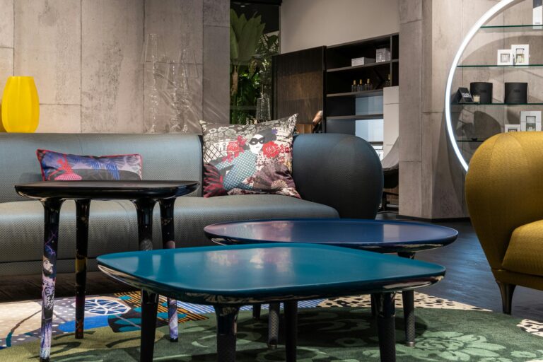
Blue is the most broadly supported. Cooler blues, particularly those with a slight gray or green undertone, are associated with reduced heart rate, lower perceived stress, and a sense of reliable calm. They don’t demand attention. They create space. For someone who spends much of their inner life managing social anticipation, a blue environment feels like permission to exhale.
Sage and muted greens carry a similar quality. Green sits in the middle of the visible spectrum, which means it requires the least optical adjustment from the human eye. Psychologically, it’s associated with safety, nature, and restoration. Muted greens in particular, the kind that feel more like a forest floor than a neon sign, tend to register as deeply settling for people who are easily overstimulated.
Soft lavender and dusty violet occupy an interesting middle ground. They carry enough warmth to feel comforting without the social demand of red or orange. Many people with shy or introverted tendencies describe lavender spaces as feeling private and protected, the visual equivalent of a closed door that still lets in light.
Warm neutrals like taupe, warm white, and greige (a blend of gray and beige) also perform well. They don’t carry the coolness of blue or green, but they avoid the stimulation of bolder hues. For people who want their space to feel welcoming without feeling busy, warm neutrals offer a kind of visual quiet that’s hard to achieve with more saturated colors.

What these colors have in common is low arousal. They don’t excite. They don’t signal urgency. They don’t create the psychological noise that more saturated, warmer colors tend to generate. For someone whose inner world is already rich with processing and reflection, a low-arousal visual environment feels like a gift.
Which Colors Do Shy People Tend to Avoid, and Why?
The flip side of the calming color question is equally revealing. Certain colors consistently feel uncomfortable or even threatening to people with shy or introverted tendencies, and understanding why helps clarify the underlying psychology.
Bright red is the clearest example. Red is physiologically activating. It’s associated with urgency, danger, and high social stakes. For someone who already experiences social situations as potentially threatening, red environments can amplify that sense of threat without any actual social interaction even occurring. In my years running agencies, I noticed that our most energized, conflict-comfortable team members gravitated toward red accents in their spaces. The people who preferred to work in quieter corners consistently avoided them.
Bright yellow and orange carry a different kind of challenge. They’re energizing and attention-demanding. Yellow in particular has a high reflectivity that can feel almost intrusive to people who are sensitive to light and sensory input. Orange, while warmer and more social in its associations, can feel overwhelming in its full-saturation form. Muted versions of both colors, like ochre or terracotta, tend to be far more tolerable.
High-contrast environments, regardless of the specific colors involved, tend to be more taxing for shy and introverted people. A space with stark white walls, black furniture, and bright accent colors creates a kind of visual tension that mirrors social tension. It keeps the nervous system slightly elevated, which is the opposite of what someone who processes the world quietly needs.
One thing worth noting here: shyness exists on a spectrum, and so does its relationship with color. Someone who is fairly introverted might find that they can tolerate more visual stimulation than someone who is extremely introverted. If you’ve ever wondered where your own preferences fall on that continuum, exploring the difference between fairly introverted vs extremely introverted can help you understand why your sensory thresholds might differ from other introverts you know.
How Does This Play Out in Real Spaces and Workplaces?
Color preference isn’t just an abstract psychological curiosity. It shapes how comfortable people feel in their homes, offices, and public spaces, and it has real implications for productivity, wellbeing, and social confidence.
I spent over two decades in advertising, and the visual environments of agencies were almost universally designed for extroverted energy. Bright colors, exposed brick, open plans, neon signs with motivational slogans. The aesthetic communicated creativity and momentum, but for quieter team members, it often communicated something else entirely: this space was not designed with you in mind.
One of the most significant shifts I made when I eventually had control over my own workspace was choosing a deep, muted blue-green for the walls of my office. It sounds like a small thing. It wasn’t. The quality of my thinking changed in that room. I was less reactive, more deliberate, and more able to access the kind of sustained focus that my best work required. The color wasn’t doing the thinking for me, but it was creating conditions where my natural way of thinking could actually function.
Workplaces are increasingly recognizing this. The relationship between environmental design and cognitive performance is well-documented, and forward-thinking organizations are starting to create varied spaces that serve different working styles rather than defaulting to one-size-fits-all open plans with high-energy aesthetics.
For people working from home, this is actually an advantage. You get to choose your visual environment. Painting a home office in a color that genuinely supports your psychology isn’t decorating. It’s a form of self-knowledge made physical.
The environmental dimension of personality type is one that doesn’t get enough attention. Understanding why introverts crave depth in their interactions and environments helps explain why visual calm isn’t a luxury for quieter personalities. It’s a genuine psychological need.
Is There a Difference Between Shy and Introverted Color Preferences?
This is where it gets genuinely interesting. Shyness and introversion are related but distinct, and their color preferences, while overlapping, aren’t identical.
Shy people tend to be most drawn to colors that signal safety and reduce the sense of social exposure. Blues and soft greens work well here because they’re associated with retreat and protection. A shy person in a blue room may feel less visible, less evaluated, less at risk of the social judgment they’ve learned to anticipate. The color creates a psychological buffer.
Introverts, whose preferences are more about stimulation management than social fear, often have a slightly broader palette. Some introverts are drawn to deep, rich colors like burgundy, forest green, or navy because those colors feel immersive rather than stimulating. They create a sense of depth and enclosure that supports inward focus. A deep-colored room can feel like a cocoon, which is exactly what many introverts want from their personal spaces.
The distinction matters because shy people and introverts sometimes get lumped together in ways that flatten real differences. Someone who identifies as an omnivert vs ambivert might have a completely different relationship with color depending on whether they’re in a social-expansion phase or a recharge phase. Color preference, like personality itself, isn’t always static.
What unites shy and introverted color preferences is the rejection of high-arousal, high-contrast environments. The specific colors may vary, but the underlying need, for visual environments that don’t add to an already full inner experience, remains consistent.
There’s also a cultural dimension worth acknowledging. Color associations aren’t universal. Blue is calming in many Western contexts, but color meaning shifts across cultures, and individual experience shapes color response as much as any generalized psychology. Someone who grew up in a home where a particular color was associated with comfort and warmth will carry that association into adulthood regardless of what color psychology literature suggests.
Can Color Actually Help With Social Anxiety?
Framing this carefully matters here. Color isn’t therapy. It won’t resolve the underlying patterns that drive social anxiety or shyness, and treating it as a cure would be misleading. What color can do is modify the baseline conditions of an environment in ways that make those patterns slightly easier to manage.
Think of it this way. If you’re already carrying a full emotional load into a social situation, a visually chaotic or stimulating environment adds weight to that load. A calming visual environment doesn’t remove the weight, but it doesn’t add to it either. For someone who is shy, that difference can be meaningful.
Color in therapeutic settings has been taken seriously for decades. Clinical spaces increasingly use color intentionally, choosing softer, more muted palettes for waiting rooms and therapy offices because the evidence supports the idea that environment shapes psychological state. A broader body of work on environmental psychology suggests that physical surroundings have a measurable effect on mood, stress, and cognitive function.
For shy people specifically, the value of color may be most pronounced in spaces they control. You can’t repaint every conference room or waiting area you encounter. But you can design your home, your personal workspace, and your most-used environments in ways that consistently support rather than undermine your psychological baseline.
I’ve watched this play out with people I’ve managed over the years. One creative director at my agency, someone I’d describe as genuinely shy rather than introverted, always personalized her desk with soft blue and green objects. Plants, a blue ceramic mug, a gray-green desk mat. At the time I thought it was just aesthetic preference. Looking back, I think she was doing something quite deliberate, creating a small island of visual calm in an otherwise overstimulating environment.
What Does Your Color Preference Reveal About Your Personality Type?
Color preference isn’t a reliable diagnostic tool for personality type, and I want to be clear about that. Plenty of extroverts love blue. Plenty of shy people have a complicated relationship with red that goes beyond simple aversion. Human psychology doesn’t sort itself into clean categories.
That said, patterns exist, and paying attention to your own color responses can be a useful form of self-inquiry. If you consistently feel more comfortable in certain visual environments, that tells you something about your sensory thresholds, your nervous system’s baseline, and what conditions support your best functioning.
As an INTJ, my relationship with color has always been more functional than aesthetic. I care about what a color does to my thinking, not just how it looks. I’ve noticed that high-contrast, saturated environments make me more reactive and less strategic. Muted, cooler environments help me access the kind of deliberate, long-form thinking that defines my best work. That’s not a personality test result. It’s years of paying attention to my own experience.
If you’re curious about where your own personality falls on the introversion-extroversion spectrum, and how that might connect to your environmental preferences, the Introverted Extrovert Quiz is worth exploring. It can help you understand whether your color preferences align with a more introverted baseline or something more mixed.
Personality type research, including work published through Frontiers in Psychology, continues to explore the relationship between personality dimensions and environmental sensitivity. The picture that emerges is one of genuine individual variation, but with consistent patterns that make color psychology a legitimate lens for self-understanding.
Understanding what extroversion actually means, and how it differs from the shy-introvert experience, can also clarify why color preferences diverge so sharply between personality types. A quick look at what extroverted means in psychological terms helps explain why extroverts often seek out stimulating, high-energy environments while shy and introverted people tend to find those same environments draining.
How Can Shy People Use Color More Intentionally?
Practical application matters more than theory here. If you’re someone who experiences shyness or introversion and you’ve never thought deliberately about color in your environment, a few starting points are worth considering.
Start with the spaces you control most. Your bedroom, home office, or personal workspace are the places where color choices will have the most consistent impact. Even small changes, a different lamp shade, a new desk accessory, a plant with soft green tones, can shift the psychological quality of a space without requiring a full renovation.
Pay attention to your existing responses. Before choosing colors intentionally, notice how you already respond to the spaces you inhabit. Which rooms do you gravitate toward when you need to think clearly? Which environments make you feel slightly on edge without obvious cause? Your existing preferences are data.
Consider saturation as much as hue. The intensity of a color matters as much as the color itself. A muted, grayed-down version of almost any hue will be less stimulating than its full-saturation counterpart. If you love the warmth of orange but find it overwhelming, terracotta or burnt sienna might give you the warmth without the arousal.
Think about how color interacts with light. Natural light changes color dramatically throughout the day. A blue that feels calming in morning light might feel cold and flat by evening. Testing paint colors across different times of day before committing is worth the effort.
Use color to create micro-environments. You don’t always have control over the larger space you’re in, but you can often create small zones of visual calm within it. A desk mat, a plant, a piece of art in a soothing palette. These micro-environments signal to your nervous system that there’s a safe, low-stimulation zone available to you, even in a busy or visually overwhelming larger space.
The concept of micro-environments connects to something broader about how shy and introverted people move through the world. Whether you identify as an otrovert or ambivert, the ability to create pockets of psychological safety in varied environments is a genuine skill, and color is one of the most accessible tools for doing it.
There’s something quietly powerful about recognizing that you have agency over your sensory environment. Shyness can sometimes feel like something that happens to you, a reaction that arrives unbidden and shapes your experience without your consent. Choosing your colors intentionally is a small but meaningful act of designing conditions that support who you actually are rather than who the environment assumes you should be.
The broader conversation about how introverted and shy personalities experience the world, from social energy to sensory preferences to workplace dynamics, is one worth staying curious about. Our Introversion vs Other Traits hub is a good place to keep exploring those connections in depth.
About the Author
Keith Lacy is an introvert who’s learned to embrace his true self later in life. After 20 years in advertising and marketing leadership, including running agencies and managing Fortune 500 accounts, Keith now channels his experience into helping fellow introverts understand their strengths and build fulfilling careers. As an INTJ, he brings analytical depth and authentic perspective to every article, drawing from both professional expertise and personal growth.
Frequently Asked Questions
What is the most psychologically pleasing color for shy people?
Soft blue is most consistently associated with psychological comfort for shy people, followed closely by muted greens and gentle lavender tones. These colors share a low-arousal quality that reduces sensory stimulation and creates a sense of safety, which aligns with what shy people tend to need from their environments. The specific shade matters as much as the hue itself, with muted, slightly grayed versions of these colors generally feeling more calming than their full-saturation counterparts.
Is shyness the same as introversion when it comes to color preference?
Shyness and introversion overlap but aren’t identical, and their color preferences reflect that distinction. Shy people tend to favor colors that signal social safety and reduce the sense of exposure, making soft blues and greens particularly appealing. Introverts, whose preferences center more on stimulation management than social fear, sometimes extend into deeper, richer colors like navy or forest green that feel immersive rather than stimulating. Both groups generally avoid high-saturation, high-contrast environments that amplify sensory and social demands.
Which colors should shy people avoid in their environments?
Bright red is the color most consistently associated with increased arousal and social threat perception, making it particularly uncomfortable for shy people. High-saturation yellow and orange can also feel overwhelming because of their attention-demanding qualities and high visual energy. High-contrast environments generally, regardless of specific color combinations, tend to keep the nervous system slightly elevated in ways that work against the calm that shy people need. Muted versions of warmer colors, like terracotta or ochre, are often more tolerable than their full-saturation equivalents.
Can changing the colors in my environment actually help with shyness?
Color won’t resolve the underlying patterns that drive shyness, but it can meaningfully modify the baseline conditions of an environment. A calming visual environment reduces the sensory load that shy people carry into social situations, which can make those situations slightly more manageable. The effect is most pronounced in spaces you control consistently, like your home or personal workspace. Think of it as creating conditions that support your psychology rather than working against it, which is a different thing from treating shyness as a problem to be solved with paint.
Do color preferences for shy people vary across cultures?
Color associations are not universal, and cultural context shapes color meaning significantly. Blue is calming in many Western psychological frameworks, but color responses are also shaped by personal history, cultural background, and individual associations formed through lived experience. Someone who grew up in a home where a particular color represented comfort and warmth will carry that association into adulthood regardless of generalized color psychology findings. The patterns described in color psychology research are tendencies, not rules, and individual variation is real and worth honoring.