Mindful Grey by Sherwin Williams is a warm, mid-tone greige that sits at the intersection of gray and beige, creating a calming neutral that feels grounded without being cold. Its understated depth makes it particularly appealing to people who crave environments that feel settled, soft, and genuinely restorative.
Color isn’t decorating. Color is psychology made visible. And for those of us who process the world at a deeper frequency, the shades we surround ourselves with at home carry more weight than most people realize.
I didn’t always think this way. For most of my agency years, I treated home like a recovery station between work obligations, not a place I designed with any intention. That changed when I started paying attention to how different spaces made me feel, and more importantly, why.

Color choices connect directly to mental health in ways that are easy to overlook. Our Introvert Mental Health hub covers the full range of emotional wellbeing topics for introverts and highly sensitive people, and the question of environment sits at the center of almost every conversation we have there. What you paint your walls matters more than it sounds.
Why Do Introverts and Highly Sensitive People Respond So Strongly to Color?
Not everyone experiences a room the same way. Some people walk into a space and see walls. Others walk in and feel the walls. If you identify as an introvert or a highly sensitive person, you likely belong to the second group.
Elaine Aron’s foundational work on high sensitivity describes a trait where the nervous system processes sensory and emotional input more thoroughly than average. That deeper processing isn’t a flaw. It’s a feature that comes with real costs in overstimulating environments. Bright, chaotic, visually loud spaces don’t just feel aesthetically unpleasant to highly sensitive people. They can feel genuinely exhausting. Managing that kind of HSP overwhelm and sensory overload often starts with the most basic layer of your environment: color.
Warm neutrals occupy a specific psychological territory. They’re present without being demanding. They give the eye somewhere to rest. For someone who spends the day absorbing stimulation from meetings, screens, open offices, and social obligations, coming home to a wall color that asks nothing of you is a genuine form of relief.
I remember redesigning my home office during a particularly brutal stretch of agency growth. We had just taken on three new Fortune 500 clients simultaneously, and I was running on about five hours of sleep a night. My office at the time was painted a sharp, cool white that I’d chosen because it looked professional in listing photos. Every morning I sat down at my desk and felt vaguely tense before I’d even opened my laptop. Switching to a warm greige in that space changed something I couldn’t fully explain at the time. The work was the same. The pressure was the same. But the room stopped fighting me.
What Exactly Is Mindful Grey and How Does It Behave on Walls?
Mindful Grey (SW 7016) sits in Sherwin Williams’ Naturals collection, a palette built around earthy, organic tones that feel pulled from the landscape rather than manufactured. Its Light Reflectance Value is 46, placing it in the mid-range, meaning it absorbs a meaningful amount of light without making a room feel dark or heavy.
What makes this color interesting is its undertone behavior. In cool northern light, it reads closer to a true gray with subtle green undertones. In warm southern or western light, those beige qualities come forward and the color softens considerably. This chameleon quality is exactly what makes it so livable. The color shifts with the day rather than asserting a fixed mood.
Compare it to some of its neighbors in the Sherwin Williams lineup. Agreeable Gray (SW 7029) is lighter and more definitively beige. Repose Gray (SW 7015) sits in similar LRV territory but leans cooler and more purple in certain lights. Accessible Beige (SW 7036) is warmer and earthier. Mindful Grey occupies a specific middle ground that feels neither clinical nor overly rustic. That balance is harder to achieve than it sounds.

The name itself is worth pausing on. Sherwin Williams didn’t call this color Quiet Grey or Neutral Grey or Basic Grey. They called it Mindful. That framing carries an implicit promise about what the color is meant to do for the person living with it.
How Does Environmental Color Connect to Anxiety and Nervous System Regulation?
The relationship between color and psychological state has been studied in clinical and environmental psychology for decades. Color perception activates the autonomic nervous system, influencing heart rate, cortisol levels, and arousal states in measurable ways. Saturated, high-contrast colors tend to increase activation. Muted, low-saturation colors tend to support calm.
This matters enormously for anyone managing HSP anxiety, where the nervous system is already operating closer to its threshold than average. The National Institute of Mental Health describes anxiety as involving persistent worry and physical symptoms tied to nervous system activation. While paint color isn’t a treatment for clinical anxiety, the environment we inhabit either adds to or subtracts from our daily regulation load.
Think of it as a cumulative effect. Every sensory input across a day either costs you something or gives something back. A color that actively soothes rather than stimulates is a small but real deposit into your capacity to function well.
There’s solid environmental psychology research connecting warm neutrals specifically to feelings of psychological safety and groundedness. A study published in PubMed Central examined how environmental factors affect mood and stress regulation, finding that physical surroundings play a meaningful role in emotional states over time. Color saturation and warmth were among the variables that showed consistent effects.
For someone who processes emotion deeply, as many introverts and highly sensitive people do, that cumulative environmental effect isn’t abstract. It’s the difference between arriving at the end of a workday with some reserves left and arriving completely depleted.
Which Rooms Benefit Most From Mindful Grey?
The answer depends partly on your light conditions and partly on what you need each space to do for you emotionally. That second question is the one most people skip.
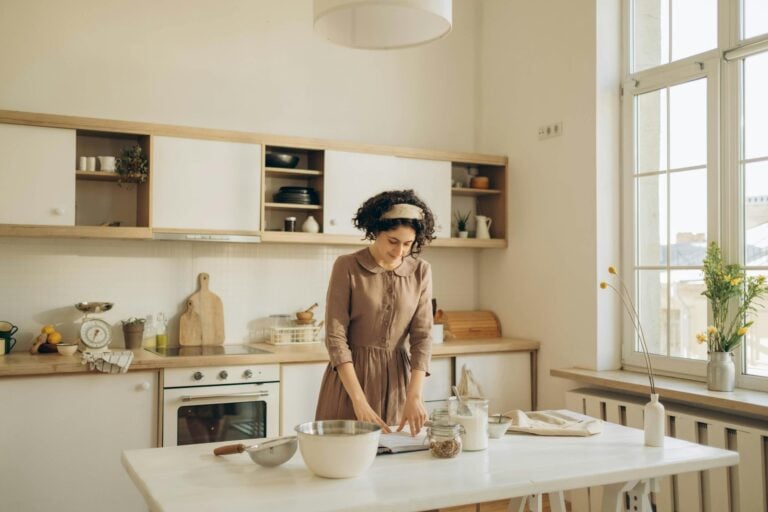
Bedrooms are the most obvious candidate. Sleep quality connects directly to nervous system health, and a bedroom that feels visually calm supports the psychological transition from waking to resting. Mindful Grey in a bedroom with warm-toned lighting and natural textiles creates an environment that genuinely signals safety to an overstimulated nervous system. The research on environmental psychology and sleep consistently points toward low-stimulation environments as supportive of restorative rest.
Home offices are the second place I’d consider it, particularly for introverts who work from home and need a space that supports deep focus without visual distraction. My own experience with this is hard to overstate. After that office renovation I mentioned, my ability to sustain concentration improved noticeably. I’d attributed it to other factors for months before realizing the color change was doing real work.

Living rooms present a more nuanced case. If your living room is your primary decompression space after social or professional demands, Mindful Grey works beautifully. If it’s also where you entertain regularly and want the space to feel more energized, you might find the color a touch subdued. That’s not a flaw in the color. That’s useful information about what you’re asking the space to do.
Kitchens and bathrooms with limited natural light can be tricky. With an LRV of 46, Mindful Grey needs some light to show its warmth. In a north-facing bathroom with a single overhead fixture, it can read darker and slightly green-tinged. Testing a large sample board in your specific conditions before committing is genuinely important here, not just standard decorating advice.
What Does Designing for Emotional Depth Actually Look Like?
Choosing a wall color is one layer. The fuller picture involves understanding what you’re trying to create and why, which requires a level of self-awareness that introverts and highly sensitive people often have in abundance but don’t always apply to their physical spaces.
One of the things I’ve noticed in myself over the years is how much I process through my physical environment. As an INTJ, I tend to work through problems internally, running scenarios and possibilities in my mind before I surface with conclusions. That internal processing requires a certain quality of quiet, not just auditory quiet but visual quiet too. A room that’s visually busy or emotionally demanding pulls at my attention in ways that interrupt that process.
This connects to something broader about HSP emotional processing. When you feel things at depth, you need environments that don’t add to the processing load. A color like Mindful Grey doesn’t demand interpretation. It doesn’t assert a mood. It creates a container that allows whatever you’re actually feeling to exist without competition.
At one of my agencies, I had a creative director who was a highly sensitive person in the fullest sense. She produced extraordinary work and was deeply attuned to client needs in ways that went well beyond what most account managers could manage. She also burned out twice in three years. When we finally talked honestly about what was happening, a lot of it traced back to environment. Her workspace was shared, loud, visually stimulating, and offered no recovery space. We made some changes. Quieter corner. Warmer lighting. A small dedicated space she could use for focused work. The improvement was significant and relatively fast. Environment wasn’t the only factor, but it was a real one.
Designing intentionally for your emotional needs isn’t indulgence. It’s maintenance. The same way an athlete pays attention to nutrition and recovery, someone with a deeply processing nervous system benefits from paying attention to the environments they inhabit.
How Does Color Choice Intersect With Perfectionism and the Need for Control?
Here’s something I’ve noticed in myself and in the introverts I talk with regularly. The process of choosing a paint color can become its own source of stress. The paralysis of too many options. The fear of getting it wrong. The sense that the “right” choice exists somewhere and you haven’t found it yet.
That pattern connects directly to what many highly sensitive people experience around HSP perfectionism and high standards. The drive for the ideal outcome is real and often produces genuinely excellent results. It also has a shadow side where the pursuit of perfect becomes an obstacle to good. A room that stays unpainted for two years while you deliberate isn’t serving your nervous system. A room painted in a thoughtful, calming neutral that you chose with care is already doing meaningful work, even if it’s not the theoretically perfect choice.
My approach after years of overthinking these decisions has become deliberately more pragmatic. I ask myself what I need the space to do. I identify two or three colors that could plausibly do that. I test them in the actual light conditions of the room. I pick the one that feels most like rest. That process has served me better than exhaustive comparison shopping ever did.
Mindful Grey tends to perform well in that kind of practical test precisely because it doesn’t assert itself. You don’t have to work around it. It works around you.

What Colors Pair Well With Mindful Grey for a Restorative Space?
Color doesn’t exist in isolation. The full environment includes trim, furniture, textiles, and accent colors, and those relationships either reinforce or undermine what the wall color is trying to do.
For trim, bright white can create more contrast than feels comfortable with Mindful Grey’s warmth. Creamy whites like Sherwin Williams’ Alabaster or Dover White tend to feel more cohesive. The slight warmth in the trim echoes the warmth in the wall and the overall effect is unified rather than fractured.
For furniture and textiles, natural materials work particularly well. Warm wood tones, linen, wool, and cotton in earthy or muted colors all sit comfortably alongside Mindful Grey. The palette you’re building is essentially one of organic calm, and synthetic brights tend to disrupt it.
Accent colors are where you can introduce some personality without sacrificing the restorative quality of the space. Dusty blues and soft sage greens both work beautifully. Terracotta and warm rust tones add depth without adding stimulation. Deep navy used sparingly can create a grounding effect that feels intentional rather than heavy.
What to avoid: anything with high saturation or strong cool undertones. Bright white, stark black, and vivid accent colors all create visual tension that works against the psychological purpose of the palette. If you’re building a space specifically to support nervous system recovery, every element should be working toward that goal.
Why Does Belonging in a Space Matter So Much for Highly Sensitive People?
There’s a dimension to home environment that goes beyond sensory comfort. For highly sensitive people especially, the spaces they inhabit carry emotional meaning that can be hard to articulate but is very real in its effects.
Part of what makes a space feel like yours is the sense that it was chosen with your actual self in mind, not the self you’re supposed to present to the world. Many introverts spend significant portions of their professional lives performing a version of themselves that’s more extroverted, more immediately available, more visually energetic than they actually are. Home is where that performance stops. The environment you create there should reflect and support who you actually are, not who the world expects you to be.
Highly sensitive people often experience a particular vulnerability around belonging and rejection that makes the home even more important as a sanctuary. The experience of HSP rejection and its emotional aftermath can be significant, and having a physical space that feels genuinely safe and restorative matters in that context. Color is one layer of that. The sense that your home was designed for your real self is another.
I’ve talked to introverts who described coming home to certain spaces as a physical exhale. That’s the goal. A warm neutral like Mindful Grey contributes to that effect in a way that’s quiet enough to be easy to overlook but consistent enough to be real.
The empathy many highly sensitive people carry also means they’re often attuned to how their spaces affect others, sometimes to a fault. There’s a tendency to design for guests, for appearances, for what looks impressive in photos, rather than for what actually serves the person who lives there. HSP empathy is a genuine gift, and it can also pull you away from your own needs when you’re not paying attention. Designing your home for yourself first is a form of self-respect that pays dividends in daily life.
How Do You Actually Test Whether a Color Is Right for Your Space?
The single most important thing you can do before committing to any paint color is test it properly. Not a small swatch card from the store. Not a digital rendering on your phone. A large painted sample on your actual wall, observed at different times of day and in different lighting conditions.
Sherwin Williams sells sample pots that allow you to paint a two-foot by two-foot area. Paint two coats on a piece of white foam board or directly on the wall and observe it over at least two full days. Look at it in morning light. Look at it in afternoon sun. Look at it under your evening artificial lighting. The color will shift, sometimes dramatically, and what you’re looking for is whether it still feels right across those different conditions.
For Mindful Grey specifically, pay particular attention to how it reads under your artificial lighting in the evening. Warm incandescent or LED bulbs will pull out the beige and make it feel cozy. Cool daylight bulbs can push it toward a slightly greener gray. Neither is wrong, but knowing which version you’re getting helps you make a confident decision rather than a hopeful one.

The environmental psychology research from the University of Northern Iowa on color perception in interior spaces reinforces what decorators have known practically for years: the same color can read as meaningfully different depending on the light source, the surrounding surfaces, and the size of the space. Your specific conditions matter more than any general description of a color.
One more practical note. The finish you choose affects perception as much as the color itself. Flat and matte finishes absorb light and make colors appear slightly darker and softer. Eggshell adds a subtle sheen that brightens colors slightly and is more practical for most living spaces. Satin is more washable but adds more reflectivity, which can make a warm neutral feel slightly more formal. For a restorative space, flat or eggshell tends to preserve the softness that makes Mindful Grey work.
What Does Intentional Space Design Say About Self-Knowledge?
Choosing how to design your home environment is in the end an act of self-knowledge. It requires you to know what you need, what depletes you, what restores you, and what kind of space supports the life you’re actually trying to live rather than the life you think you should want.
That kind of self-knowledge takes time to develop. For much of my agency career, I genuinely didn’t know what I needed from my environment because I hadn’t slowed down enough to ask. I was running on adrenaline and caffeine and the assumption that comfort was something you earned after the work was done. What I’ve come to understand is that the environment you create for yourself is part of how you sustain the capacity to do good work in the first place.
The American Psychological Association’s framework on resilience points consistently toward the role of supportive environments in maintaining psychological wellbeing over time. Physical spaces are part of that environment. The home you design is either a resource or a drain, and that choice is largely yours to make.
Mindful Grey is a paint color. But the choice to select it, to prioritize calm over statement, rest over impression, warmth over edge, reflects something real about what you value and what you need. For introverts and highly sensitive people who spend significant energy managing a world calibrated for louder nervous systems, that choice carries genuine meaning.
The clinical literature on sensory processing increasingly supports the idea that environmental modification is a legitimate and effective strategy for managing sensory sensitivity. You’re not being precious by caring about your wall color. You’re being strategic.
There’s also something worth saying about the act of paying attention to yourself in this way. Many introverts and highly sensitive people are extraordinarily attuned to others and remarkably neglectful of their own needs. Spending time understanding what your nervous system requires and then actually creating it is a form of self-respect that has downstream effects on everything else, your work, your relationships, your capacity for the kind of depth and care you naturally bring to the world.
If you’re exploring the broader terrain of introvert and HSP mental health, our complete Introvert Mental Health hub covers everything from emotional processing to anxiety, sensory overwhelm, and building sustainable wellbeing as someone wired for depth.
About the Author
Keith Lacy is an introvert who’s learned to embrace his true self later in life. After 20 years in advertising and marketing leadership, including running agencies and managing Fortune 500 accounts, Keith now channels his experience into helping fellow introverts understand their strengths and build fulfilling careers. As an INTJ, he brings analytical depth and authentic perspective to every article, drawing from both professional expertise and personal growth.
Frequently Asked Questions
Is Mindful Grey by Sherwin Williams warm or cool?
Mindful Grey reads as a warm neutral in most lighting conditions, particularly in spaces with warm or southern-facing light. In cooler northern light, its subtle green undertones can emerge and give it a slightly cooler appearance. Testing it in your specific space is the most reliable way to know how it will behave in your home.
What is the LRV of Mindful Grey SW 7016?
Mindful Grey has a Light Reflectance Value of 46, placing it in the mid-tone range. It absorbs enough light to feel grounded and substantial without making a room feel dark or heavy. Spaces with good natural light will show its warmth most effectively.
How does Mindful Grey compare to Repose Gray?
Both colors sit in similar LRV territory, but they have meaningfully different undertones. Repose Gray leans cooler and can show purple or lavender undertones in certain lights. Mindful Grey leans warmer with beige and occasional green undertones. For a space aimed at warmth and calm, Mindful Grey generally reads as more inviting and less clinical than Repose Gray.
Why do introverts and highly sensitive people benefit from calming wall colors?
Introverts and highly sensitive people tend to process sensory and emotional input more thoroughly than average, which means overstimulating environments carry a real cost in terms of energy and regulation. Calming, low-saturation colors like Mindful Grey reduce visual stimulation, which contributes to a lower overall sensory load at home. Over time, that difference accumulates into more capacity for focus, rest, and emotional recovery.
What trim color works best with Mindful Grey?
Creamy whites with warm undertones tend to pair most harmoniously with Mindful Grey. Sherwin Williams’ Alabaster and Dover White are both strong options. Bright, stark whites can create more contrast than feels comfortable with Mindful Grey’s warmth. The goal is a trim color that feels cohesive with the wall rather than competing with it.